Art 2023: Year in Review

In my WriYe 2023: Year in Review I quoted a couple of times from my 2022 review post, and I think there’s something important to quote from the Art 2022 post.

I just want to be good at things. I want to be good enough. I don’t feel like I ever will be, with writing or with art, and so it’s a constant crisis of faith everyday. I try and persist even as I ask why. I have dreams, of art supplementing writing – two careers in a sense. Which is perhaps why I am struggling to balance them as I want to work both of them full time, but I am incapable of doing anything full time due to my disability.

Art 2022, Year in Review

As basically that’s probably accurate. It’s a struggle.

This year I did not go through courses how I would have liked. I did not implement a regular habit. I did not act with discipline when it came to learning and improving at all. It was another year that I did not do those things. But I did make some pieces of art (posted about some of them):

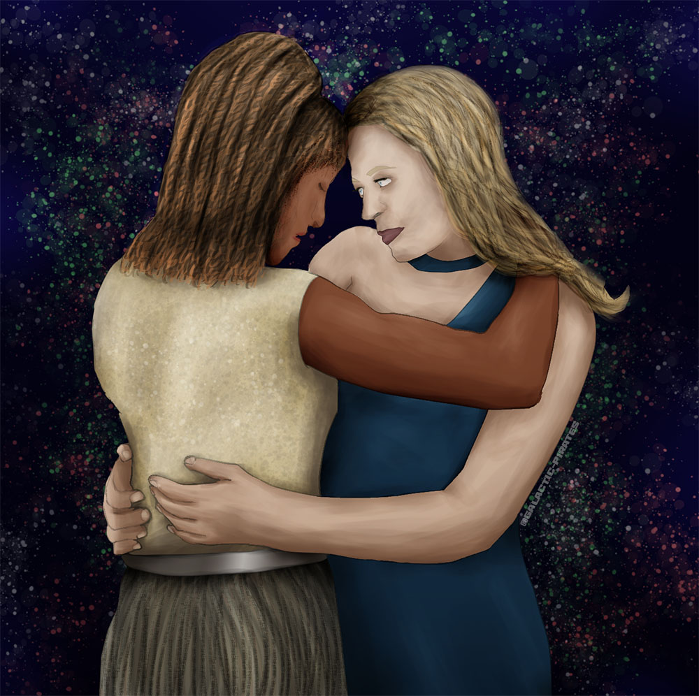
First two are digital. Done in Clip Studio Paint and Procreate respectively.

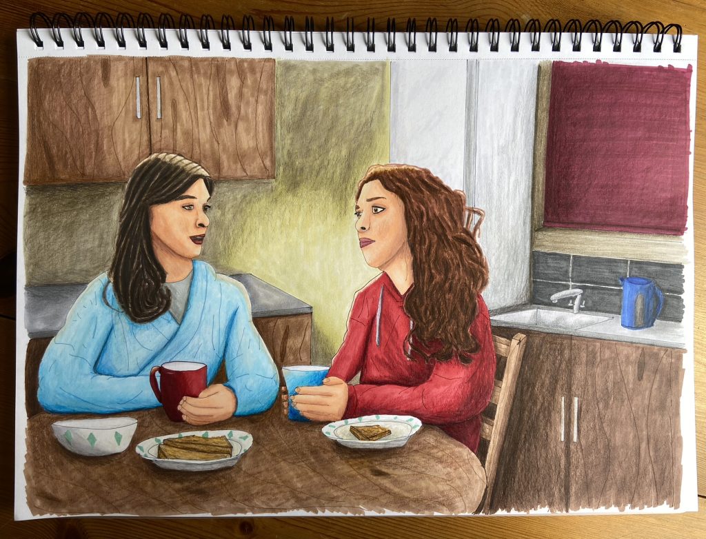
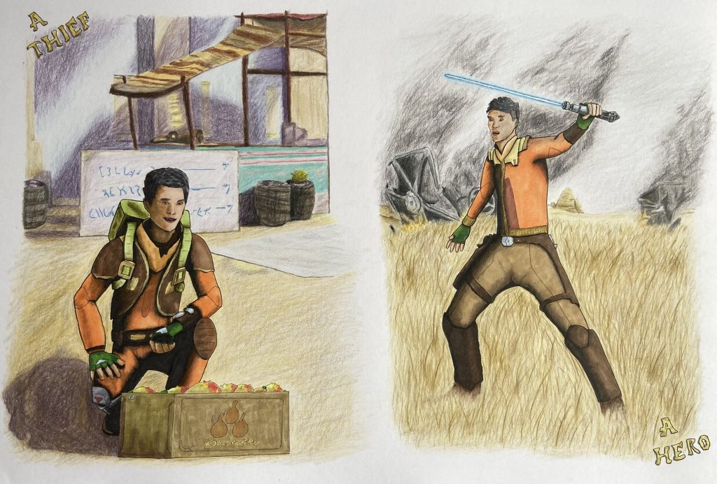
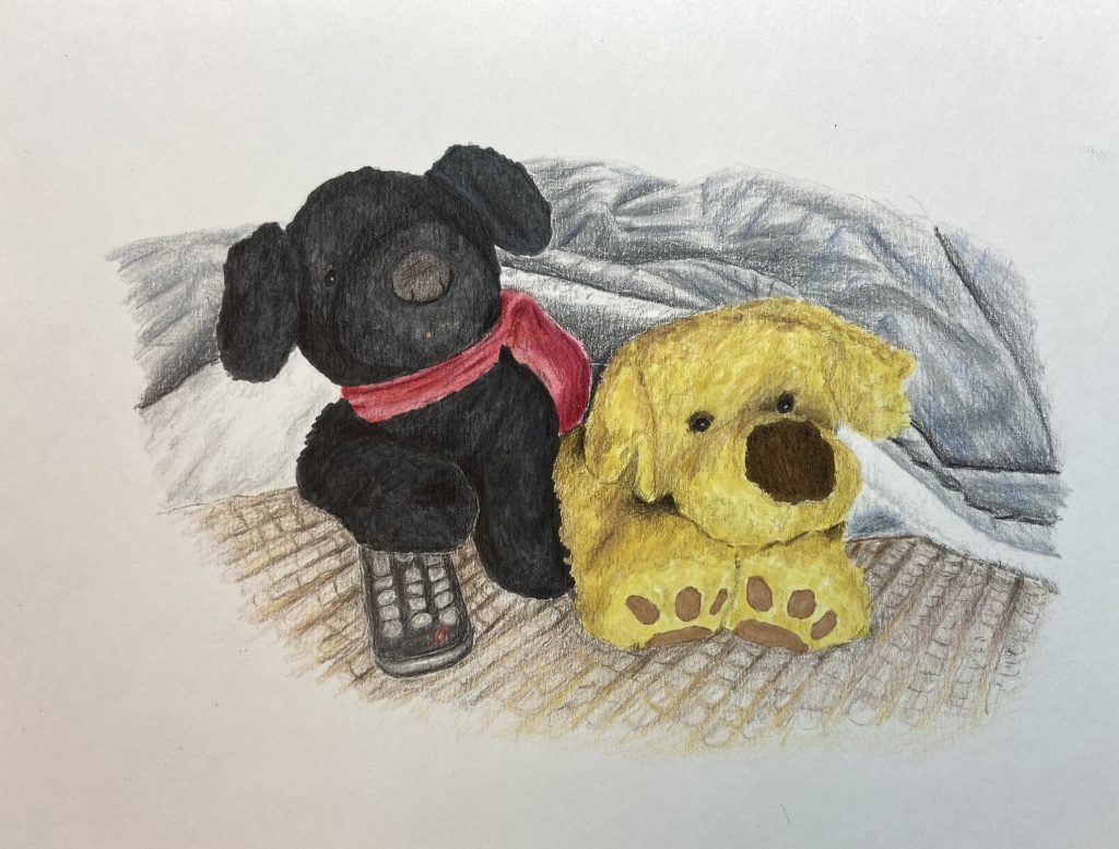
Next three are markers and coloured pencils.

Final four are watercolour/watercolour pencils, plus maybe a little regular coloured pencil or gauche for cleaning up.

I think I learned some things and at least I kept my hand in. There is still so much to learn, and I am so far from where I would like to go, but I did something. I could have made nothing. There are 9 pieces in and I remember when I used to set a goal for “a big piece per month” and so in that light, I’m doing ok.

Plus there’s always next year. As always I have hopes and dreams. Hopefully next year I will have a lot more to show off – key word, hopefully.

This was inked. I made special effort with the line weights and even did some attempts at ‘comic book style inking’ for the shadows. Ezekiel (as Ezra) was done mostly with markers but some coloured pencil touch-ups. The background was done entirely with coloured pencils. I wanted it to be softer and for Ezekiel to pop more. So the background wasn’t inked, so there were no hard lines and also the saturation of colour was a bit less as the markers are stronger.

I’m relatively pleased with the composition. I think the one on the right (in the field) came out the best. I like the background on that. I think the grass field rendered well and I blended his feet in nicely. The smoke isn’t that good but it’s not terrible either. However, the background at the market went a bit wrong. I got a bit lost doing the stall. Also I’m sure I messed up the perspective on the box and probably elsewhere too.

The shadows on the market picture are the worst. The ones in the background are just bad really. I made an effort but it’s not good. The comic inking shadows on both didn’t come out that well either. I think perhaps I did it wrong. It didn’t blend in and look right. It was definitely too intense on Ezekiel’s side in the field picture.

I still feel like there isn’t much life in the pose. It’s very stiff. I suspect that’s to do with my linework. It’s not very fluid as I’m careful in copying my mocked up ‘sketch’. I still have a lot to learn.

Watercolour pencil painting of Galahad, in Camelot times.

I had a reference for the horse and the background. It was the rider/knight and the pose with the sword that I changed. My reference was blurry which I think didn’t really help. I wanted a somewhat blurry, fantasy background. Sort of like he’s riding and that’s why the details can’t really be seen. However, I don’t feel like I achieved that. I think it’s just a mess of colour, and the ‘glaze’ I tried to add at the bottom for the dust the horse was kicking up didn’t work at all.

I can see far more of the paper texture than I am comfortable with. I don’t know if that means I didn’t use enough pigment or if it’s just this paper. It’s a new watercolour pad and I think it’s cold-press (I usually use hot-press which is smoother).

He looks rather stiff and unnatural and his torso isn’t correct. I don’t know if that’s in the shaping or in the shadows meaning it doesn’t look like it has form. I definitely think I need to lay more pigment down, and possibly use less water. I’m still learning the balance.

Watercolour painting with a some coloured pencil corrective work.

Attempt at a comic book style three panel strip. I like how the title painted and the bolts in space look alright. I sketched this with the grid method from the digital mock-up, rather than printing and tracing, and I’m pleased I made the attempt. I think the ship turned out ok. Not great but my reference was shaky and so the rendering of the ‘windows’ was pure guesswork. I’m pleased I tried to deepen the shadows at the bottom, there was an effort at contrast there at least.

However, the dramatic lighting I was going for (night scene, with the lightsaber glowing) did not work out. The lightsaber glow wasn’t enough. An attempt was made but executed badly. I didn’t get the shadows right. I can see now how I messed up with his leg, and lack of defined shadows there etc. Also in my effort not to overblend, I didn’t put enough contrast in several places, most notably the droid and Jacen’s face, but also his clothes. Another big mess up was with the stars. I used masking fluid to keep those areas white and they are too big and uniform.

A couple of days ago I saw a screenshot of Sabine from the Ahsoka trailer. She wasn’t in armour, just a plain shirt and jeans. I posted about how I didn’t vibe with that outfit, that it was too bland for her. That it didn’t speak to her personality in my opinion. So I decided to have a stab at coming up with an alternative.

So about the outfit!

  • The symbols on the t-shirt came from the jacket from a different scene in the trailer.
  • The engraving on the belt buckle is the Mythosaur, symbol of Mandolore.
  • Obviously the Phoenix on the back of the vest is Sabine’s emblem for the squadron.
  • I thought she should have a lot of pockets for her art stuff (spray cans, brushes etc.) so there’s the vest and then the cargo trousers. Utilitarian and comfortable.
  • She strikes me as someone very practical and badass. Hence the combat boots even when ‘off-duty’ but jazzed up with purple laces for her personality. Same with the fingerless gloves.
  • Her armour had some patterns. Mostly geometric and a lot of just colour splashes. So I tried to replicate that by giving the t-shirt like a spray effect so it’s mostly red with some purple at the top (echoing her hair).
  • For the trousers I took inspiration from images of “graffiti style” trousers. I tried to imagine what artwork Sabine would pick and so there’s the Loth Cat, symbol of the Jedi, Republic and New Republic. A representation of her favourite handheld explosive, some paint splatters, a geometric lightning bolt like she put on Ezra’s stormtrooper helmet and then a little doodle of Hera just because.

Drawn in Procreate, with thanks to PoseMuse for the shortcut.

Illustration with markers and coloured pencils, for the Bering and Wells Big Bang event.

I experimented a bit with the lighting having the line for the highlights. I also tried to copy the “Marvel’s What If?” style a bit with the inking colours. I’m relatively pleased with the composition and the skin colour is better than my last attempt with markers thank merlin.

It’s not terrible but the markers on the large background areas went streaky as I think my technique wasn’t very good. The coloured pencils didn’t blend as well as I had hoped and the shadows look weird.

Still considering I usually overwork/overblend everything to death, there was a concerted attempt at a more comic book style here. Not executed well, but attempted, and that’s a start.

Really Hardison? Slow walking in front of the explosion.

Oh you wish you looked that cool.

Just get in the damn car.

Parker? Parker! Oh hell no, Parker’s driving? I thought we had a rule about that man. I’m just saying that-

Dammit Hardison

I am getting in the car. Look I am in the car. Whoah!

Drawn for Leverage Bingo, for the second round, prompt square ‘Explosion’. Done in watercolour.

Art 2022: Year in Review

I said in the WriYe year in review I would do a post for art. Not very creatively titling but I think it actually proves a point – the art is important to me.

I didn’t write a post about art plans specifically until the end of October. It’s been an ‘impossible year’ with moving and not really knowing what I was doing. I had sort of mentally thought “oh a drawing a month” as a general goal as I have done for the past several years, but hadn’t gone much beyond that. I had the Coloured Pencil Academy course to complete and then this past summer I did get a bunch more courses on Udemy which I haven’t done.

So end of October and I had plans. I basically said that I wanted to ‘get serious’ and commit 3 hours 6 days a week to working through the courses. I had benched art during October as I had a lot of writing courses to comb through in addition to prepping for NaNo. However, I had this idea that I could draft for NaNo in the morning and do art in the afternoons.

It didn’t happen once. Not once. I didn’t do any art during November at all.

Then December and I decided to use some new supplies I got during Black Friday to make a couple of christmas presents. I had to practice using them first of course, and so December I spent totally on art – no writing at all. Not one single word.

Which really is a problem. I’ve been thinking about that, musing on it really, over the past week and I’ve sort of come round to the conclusion that I want to treat writing as a job. I want writing to be my job. Yes it’s a dream at this point but if I put in the work then maybe, just maybe, it could be reality. However, the art has increased in importance to me. In the beginning I wanted to illustrate my stories. Then I thought about making my own book covers. Then I got mega-depressed because of AI in art (hence the Black Friday art supplies), as I thought maybe if I went traditional then that might escape AI for a little longer.

I just want to be good at things. I want to be good enough. I don’t feel like I ever will be, with writing or with art, and so it’s a constant crisis of faith everyday. I try and persist even as I ask why. I have dreams, of art supplementing writing – two careers in a sense. Which is perhaps why I am struggling to balance them as I want to work both of them full time, but I am incapable of doing anything full time due to my disability.

Anyway this is what I did this year:

The top three are exercises from the Coloured Pencil Academy.

The next two are colouring pages that served as practice with markers, and watercolour pencils, respectively. The stargate art was a total mixed media project. The cars was a christmas present done in markers and coloured pencil. The landscape was a christmas present done with watercolour pencils and coloured pencil. Finally there is a digital drawing of Seven and Raffi from Star Trek: Picard.

I did the three exercises and the digital drawing in April. Everything else I did this month in December. So consistency was not really a thing this year.

I think about the best thing I can say is that I tried. I didn’t forget that I wanted to do art, I just struggled and didn’t do it most of the time. I’m still a very long way from where I would like to be.

Anyway I am going to end this post with the same thing I put at the end of the WriYe retrospective – now I just need to work out how to build on this and move forward in 2023.

Art: My Old Nemesis

My habit when I do a goal post is to look back at the previous goal post, so I can say “this is what I said I would do last time” and “this is what actually happened”. With writing that review can get long as I’ve been doing that a long time. With art? How long has it been? I didn’t do a post with any intentions really for this year. I think I might have briefly mentioned art in my WriYe post but I knew 2022 was going to be crazy with moving. That also tanked the end of last year so I don’t think I did a proper wrap-up for 2021 art-wise either.

So as a little baby review
I think I first started trying to draw things when I was 19. And by draw things I mean I traced around photos, colour picked off them, and did gradients as a form of shading. Still it gave me a taste for it. I quit for some years to be honest, or at least I can’t find from poking around on my HD anything I really did between then and when I went back to fandom in 2016. Again I started off with just tracing but then I started trying to do a little more. I changed the clothing first, and then I wasn’t satisfied with that and tried a modelling program to make my own reference. I traced around that, but at least it wasn’t just a photo (or so I told myself).

So it continued like that and then December 2020 was something that didn’t come from any single reference. I had failed at making a 3D model, so I tried to find photos that were close and then I’d shifted it around. I even took some photos of my own hands to try and get the angles right.

2021 I obtained my first art course, and I started trying more traditional art (not just digital). By the looks of things I did 4 digital + 2 traditional drawings in 2021.

This year, 2022, I did a couple of eye drawings on paper with pencils, and a drawing of some roses with coloured pencils (following the Coloured Pencil Academy course). I also did one digital drawing of Seven and Raffi from Star Trek: Picard. Finally I signed up when the courses were 75% off on Udemy for 7 different art courses. Promptly I did not do any of them because 2022 = crazy year.

Why am I posting this now and not end of December ready for next year?
Because there are still two months of 2022 left.

Following the HB90 system, there are three goals per quarter. Goal #1 is obviously writing, but Goal #2 is art. Now with still sorting out some house things, and all the writing courses I wanted to evaluate, I decided to bench art until November – but guess what, it’s November tomorrow.

Yesterday, I went over the art courses and found places they overlapped and worked out a tentative plan of how to work my way through them. I decided that I should stick with the Coloured Pencil Academy course and finish that first.

So the intention from November 1st, is on every possible occasion Monday-Saturday, commit three hours per day to working on the art. That isn’t demanding any kind of pieces, or amount of progress, as I don’t know how long the various courses or assignments will take me. Some sessions I might be watching videos and taking notes. Other times I will be working on an assignment. Some days I might decide to just work on something I feel like doing and not one of the courses, who knows! But I am going to try and stick to those three hours unless there is a reason why I can’t (illness, appointment etc.)

I think I put in a previous art post that I felt like where I was with art, was akin to where I have been with writing. I don’t have much confidence, I might have been scratching around for years now but that doesn’t mean I have made years worth of progress. I think I declared at the start of 2020 I was “getting serious” and then promptly didn’t do much but 2020 wasn’t anyone’s year. I had so many panic attacks that year, it was hard to do much of anything.

Now I’m in control of my environment I don’t feel as inhibited. I am hoping that will mean I can embrace doing art regularly and then (thanks to the regular practice) hopefully improve. Cross fingers. Time will tell.
Drawing 4: MerMay

Oh dear. I started the last post, critiquing March’s drawing going “third month running! I’m sticking to my promise” aka “Yay!” and now it’s August. In my defence I did a drawing in April but it wasn’t digital, it was with colouring pencils. I attempted a landscape for my mum’s birthday. So theoretically that could have kinda counted for April’s drawing and I did start this one in May – it was for MerMay as the title says – but then I never finished it.

I was without my PC for three weeks end of May and into June. I should have then picked the drawing up but I’d started a ridiculous number of fanfic WIPs while I was without a computer. So I sort of lost the rest of June and July to clearing the decks a little bit. Unfortunate because I did sign up for a drawing course – which I haven’t touched. Still, the intentions are very much there so all is not lost in my art goals for the year just yet.

Anyway the drawing! It was done as a cover for the Sanctuary fanfic I wrote The Tragic Tail.

I have to be honest I tried something new with this one. I did the bulk of the drawing in Clip Studio Paint, as opposed to just the line work and then swapping to Photoshop. I used an oil brush and painted, rather than doing block colouring and then blending. I don’t think it would have worked so well if I hadn’t had references that I was basically just copying. It was interesting though using a new tool.

I’m quite pleased with how the icebergs at the back came out, and the lifeboat on the left is pretty good too. The lines of the Titanic itself are a bit wobbly in places but through basically copying the reference I managed to capture the general impression I think. The ice on top of the water was more difficult and I’m not sold on that. I think it needed more highlights. I also think I over blurred in the end the mermaids body that was under the water, and I didn’t manage to draw waves, the ocean looks far too flat really.

Still considering it’s a cover it actually looks quite nice thumbnail size, which is always a good test for a cover. I like how the title came out. I’m pretty pleased with the overall effect. It’s quite simple in a lot of respects. I know I said that I felt I over blended on the last drawing I did, and I don’t think I have quite the same issue on this one. Usually I spend forever on the face but I did the mermaid quite quickly, and I didn’t worry so much about it being too dark/too light with the shadows. Some of that I think is that I wasn’t trying to capture a likeness, and also it’s a mermaid not a person which I think tricked my brain a little bit.

I think I’ll have to try again doing more colouring in Clip Studio Paint. I swapped to Photoshop for fiddling with the lighting, adding some textures etc. and of course the text. Now technically I owe at least three drawings – June, July and May (or August if we’re counting this one for May as I started it then) – and possibly April as well if we don’t count the pencil landscape I did.

As I said I bought a drawing course for coloured pencils so I see a lot more of those in my future. I need to have a think about my drawing goals and what will best serve me in terms of art progression. I thought that the pencil drawing course might help me with fundamentals which I could then apply to digital but we’ll see if that’s true or not. Either way I hope it’ll make me a better artist.